更加的智能
More intelligent
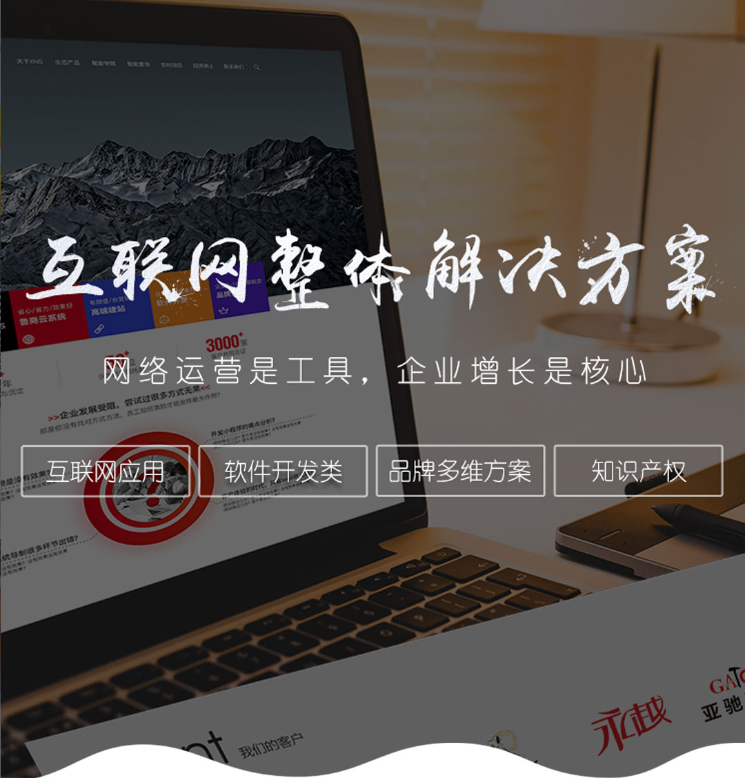
響應式網站具有智能響應設計,可應用于各種顯示尺寸和用戶設備的分辨率,避免了顯示終端不完整、布局混亂、字符置亂等問題。
The responsive website has intelligent response design, which can be applied to various display sizes and the resolution of user equipment, avoiding the problems of incomplete display terminal, chaotic layout, character scrambling and so on.
精確的對數據進行分析
Accurate analysis of data
響應式網絡分析可以提供個人電腦和手機之間的瀏覽數據比例,方便企業了解網站的客戶。基于這些數據,更重要的是對網站進行優化和精準推廣。
Responsive network analysis can provide the browsing data ratio between personal computer and mobile phone, which is convenient for enterprises to understand the customers of the website. Based on these data, it is more important to optimize and accurately promote the website.
更有利于SEO優化和管理
It is more conducive to SEO optimization and management
使用響應式網站,站長在建設過程中會按照 seo 原則對站點進行編輯,使站點有更好的 seo 基礎,更受歡迎的搜索引擎,可以避免站點的二次優化。
Using a responsive website, the webmaster will edit the site according to the SEO principle during the construction process, so that the site has a better SEO foundation and a more popular search engine, which can avoid the secondary optimization of the site.
節約開發成本
Save development cost
企業使用響應式網站時,不需要為PC和移動端口制作相應的網站。一個響應網站可以同時滿足兩個端口,節省了網站的制作成本。兩個獨立的網站需要更多的時間和精力去維護。使用響應性網站可以為優化器節省更多的精力和時間,并做其他優化工作。
When enterprises use responsive websites, they do not need to make corresponding websites for PCs and mobile ports. A response website can meet two ports at the same time, saving the production cost of the website. Two independent websites need more time and energy to maintain. Using a responsive website can save more energy and time for the optimizer and do other optimization work.
對網站訪問用戶可以有更好的體驗
Users who visit the website can have a better experience
響應式網站適應用戶的瀏覽設備,更容易贏得用戶的心和頭腦,提高用戶體驗。
Responsive websites adapt to users' browsing devices, are easier to win users' hearts and minds, and improve user experience.


 本網站部分資源來自互聯網,如有侵權,請聯系我們及時刪除.


 727671696
 15508684333
 在線留言
在線留言