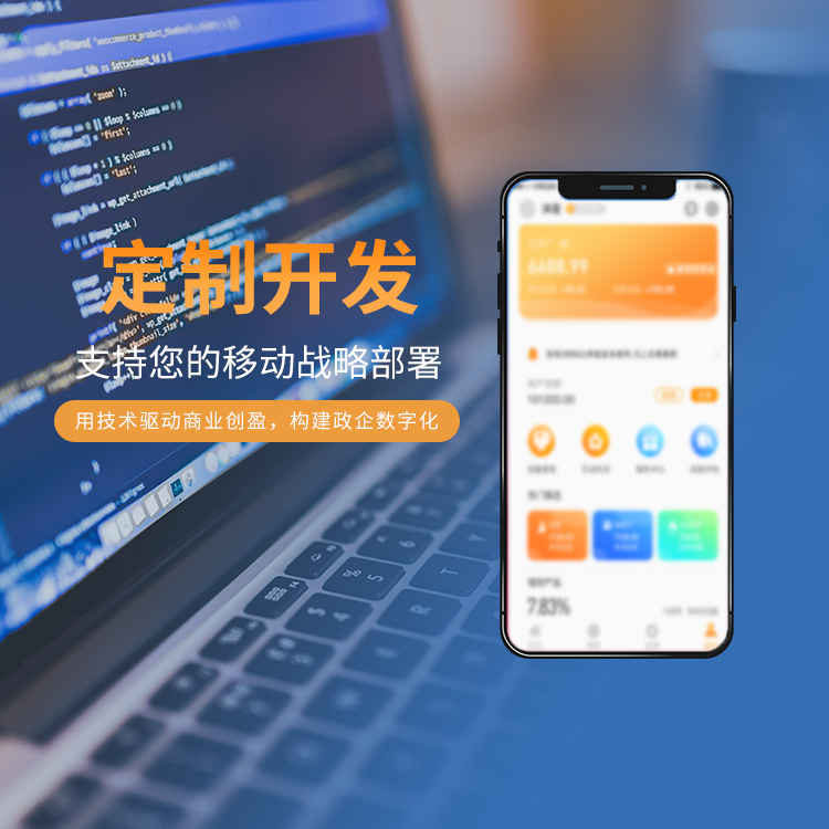
如今,許多公司具備自己的網(wǎng)站,但絕大多數(shù)網(wǎng)站僅有PC端,忽略了移動端的用戶,針對一些特定行業(yè)而言,移動端用戶占比率高。許多公司也意識到這一問題,越來越多的公司開始開發(fā)移動端網(wǎng)站建設(shè)。那么PC端與移動端的網(wǎng)站建設(shè)存在什么差異呢?下面
濟(jì)南網(wǎng)站建設(shè)公司為您進(jìn)行講解。
Today, many companies have their own websites, but the vast majority of websites are only PC based, ignoring mobile users. For some specific industries, mobile users account for a high proportion. Many companies are also aware of this problem, and more and more companies begin to develop mobile website construction. What are the differences between the website construction of PC and mobile terminals? Next, Jinan Website Construction Company will explain to you.
我們要明白二者之間的差異,一種是設(shè)計風(fēng)格的差異。有些人認(rèn)為移動端是將PC端網(wǎng)站內(nèi)容做減少,但事實(shí)并不是這樣。因為PC端與移動端網(wǎng)站的尺寸、大小不一樣,我們在PC端中顯示大量的信息,可是移動端只可以顯示一些核心有針對性的信息。這就需要我們做取舍了。
We should understand the difference between the two, one is the difference of design style. Some people think that the mobile terminal is to reduce the content of the PC website, but this is not the case. Because the size and size of the PC and mobile websites are different, we can display a lot of information on the PC, but the mobile terminal can only display some core targeted information. This requires us to make a choice.
雖然都是使用HTML和CSS技術(shù)進(jìn)行排版,但是我們在做手機(jī)網(wǎng)站的時候一般都會引入一個前端框架。前端框架提前定義了很多通用類,用框架寫手機(jī)網(wǎng)站頁面的代碼會省去很多麻煩。定義元素寬度和高度的單位也有所不同。
Although HTML and CSS technologies are used for typesetting, we usually introduce a front-end framework when building mobile websites. The front-end framework defines a lot of general classes in advance. It will save a lot of trouble to write code for mobile website pages with the framework. The units that define the width and height of an element also vary.
PC網(wǎng)站通常使用標(biāo)準(zhǔn)像素單位,而移動網(wǎng)站使用比例單位REM。與PC網(wǎng)站相比,手機(jī)網(wǎng)站的布局理念也在發(fā)生變化。移動網(wǎng)站更注重比例布局,PC網(wǎng)站更注重像素級布局。
PC websites usually use standard pixel units, while mobile websites use the scale unit REM. Compared with PC websites, the layout concept of mobile websites is also changing. Mobile websites pay more attention to proportion layout, while PC websites pay more attention to pixel level layout.
其次是二者之間的展示形式的差異,Pc端多數(shù)網(wǎng)站是有動態(tài)效果和交互體驗的,但移動端網(wǎng)站難以實(shí)現(xiàn)。如今許多網(wǎng)站使用的是html5技術(shù),不需要做兩個版本,能夠自動適應(yīng)不一樣的終端,展示為合適的頁面尺寸。動態(tài)效果和交互體驗也能夠做得很棒。
Secondly, there are differences in display forms between the two. Most websites on the Pc side have dynamic effects and interactive experiences, but mobile websites are difficult to achieve. Nowadays, many websites use HTML5 technology. They do not need to make two versions. They can automatically adapt to different terminals and display them as appropriate page sizes. Dynamic effects and interactive experiences can also be done well.

假如您有手機(jī)端網(wǎng)站建設(shè)需求,小編建議能夠采取h5網(wǎng)站建設(shè)技術(shù),做一套響應(yīng)式網(wǎng)站,交互體驗更強(qiáng)、內(nèi)容展現(xiàn)更為豐富。
If you have a demand for mobile website construction, I suggest you adopt the h5 website construction technology to build a responsive website with stronger interactive experience and richer content presentation.
訪問PC網(wǎng)站需要一臺電腦設(shè)備,這對于沒有電腦或者不方便使用的用戶來說可能是一個很大的麻煩,降低了用戶體驗。手機(jī)版網(wǎng)站就不一樣了,因為手機(jī)是便攜設(shè)備,所以手機(jī)可以隨時隨地訪問網(wǎng)站。用戶可能沒有電腦,但通常不會有手機(jī)。
Accessing a PC website requires a computer device, which may be a big trouble for users without a computer or inconvenient to use, reducing the user experience. Mobile websites are different. Because mobile phones are portable devices, mobile phones can access websites anytime and anywhere. Users may not have computers, but they usually do not have mobile phones.
但這并不意味著一個網(wǎng)站只有移動版。如果一個網(wǎng)站只有手機(jī)版沒有電腦版,當(dāng)用戶使用電腦設(shè)備訪問網(wǎng)站時,呈現(xiàn)給他們的是手機(jī)版的網(wǎng)站,那么用戶體驗同樣不好。
But this does not mean that a website only has a mobile version. If a website has only a mobile version but no computer version, when users visit the website with computer devices, they will be presented with a mobile version of the website, so the user experience is also bad.
總之,移動和PC網(wǎng)站有一些不同,但也有一些相似之處。比如網(wǎng)站用戶體驗、網(wǎng)站關(guān)鍵詞布局、網(wǎng)站框架結(jié)構(gòu)等。都需要達(dá)到搜索引擎優(yōu)化的標(biāo)準(zhǔn),這樣才有利于網(wǎng)站優(yōu)化。更多相關(guān)網(wǎng)站建設(shè)的信息要點(diǎn)就來聯(lián)系我們
http://www.sun2007.cn咨詢了解吧!
In short, there are some differences between mobile and PC websites, but there are also some similarities. Such as website user experience, website keyword layout, website frame structure, etc. You need to meet the standards of search engine optimization, which is conducive to website optimization. For more information on website construction, please contact us http://www.sun2007.cn Ask and understand!


 本網(wǎng)站部分資源來自互聯(lián)網(wǎng),如有侵權(quán),請聯(lián)系我們及時刪除.


 727671696
 15508684333
 在線留言
在線留言